Check out some of a broad variety of logos I have created over the years. New logos are added regularly.
Abyssinia is a popular Ethyopian restaurant in Mechelen.
This brand icon was created for a webshop inspired new company in padel gear and accessories.

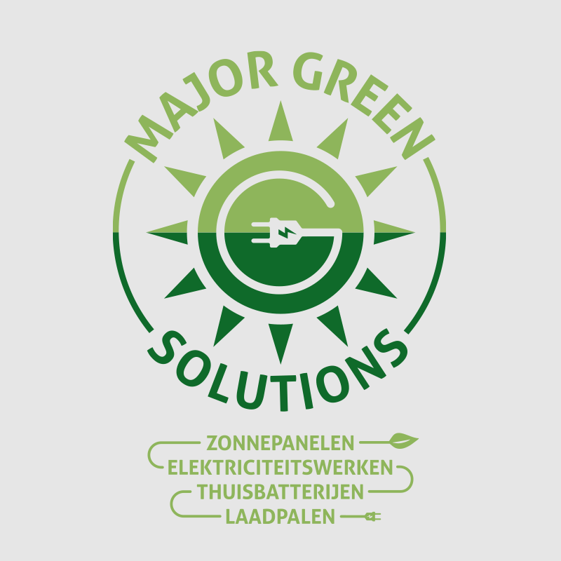
Major Green Solutions is a vibrant new energy solutions company with a green touch.

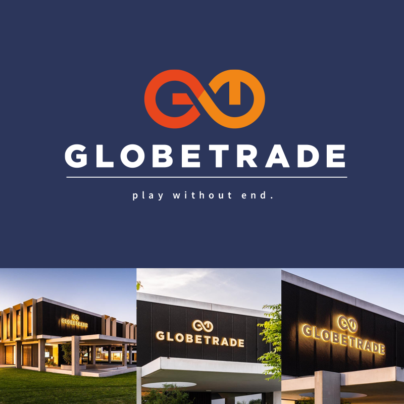
In 2022 I designed the new company logo for Globetrade. The new corporate style has been very well received, sparking a contemporary vibe of colourful creativity matched with a look of business elegance. The G and the T appear in the infinity symbol that represents the new brand icon.

Liddel Dino was a concept created for a dinosaur toy range.

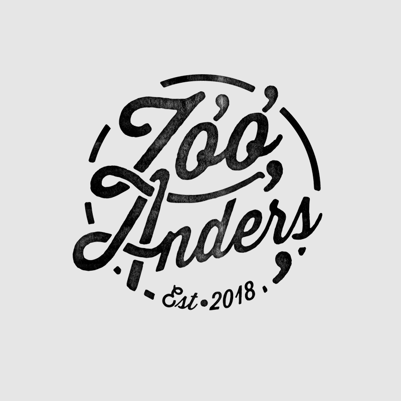
Zóó Anders (Só Different) is a childs clothing webshop. I was asked to create the logo for this artisan nordic style influenced modern fashion for kids web store based in central Belgium.
The webshop launched in 2018.

A logo for a stage, event, lighting and props prodcution company, Baanbrekend Producties.
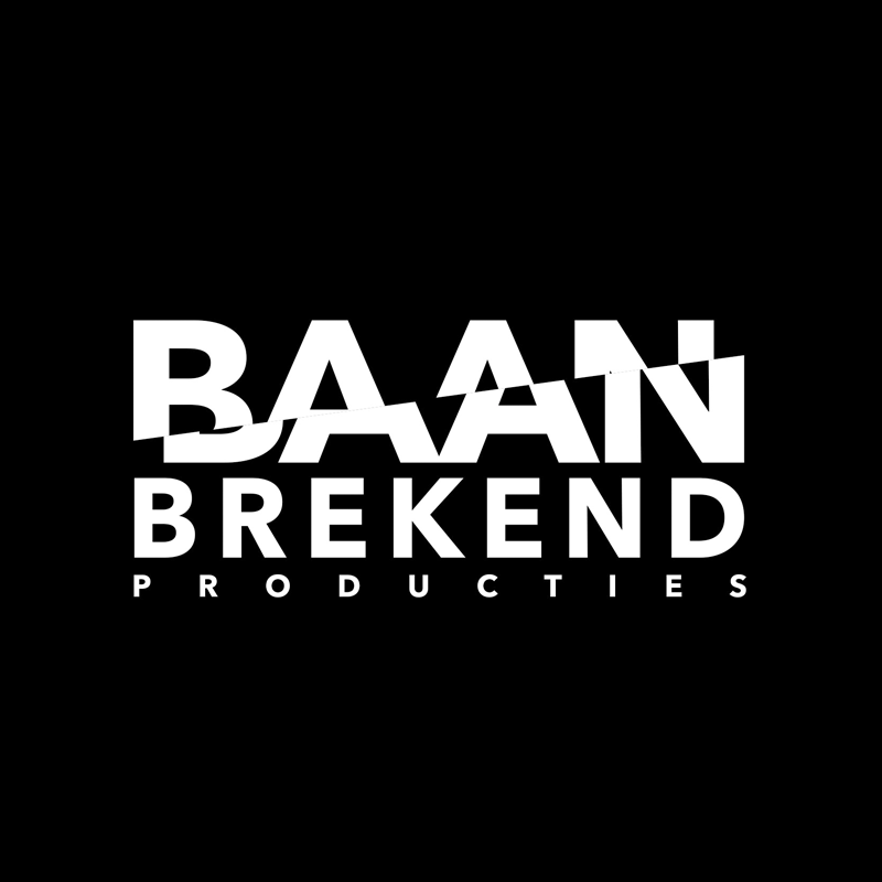
The name translates as 'groundbreaking' productions.

The logo of my own design studio, representing an eye that refers to visualization and the letter V combined with my initials OC. A rebranding took place in 2024.
The logo of Motip-Dupli that I created back when the two companies merged.

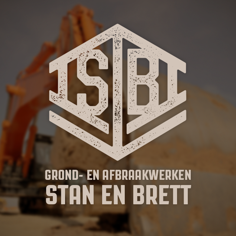
A start-up by two students in demolition and soil works. I designed a logo for their project which will eventually become their business company. The logo features two arrows, down for 'demolition' and up for 'reconstruction'. The house shape is the main element.

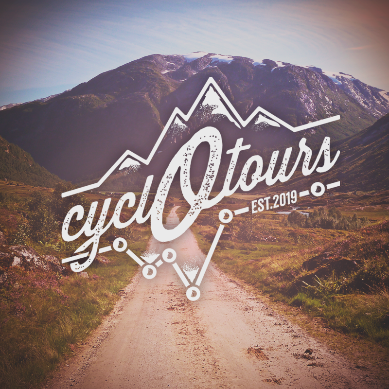
Cycl-O-tours is a concept that I created for myself as a means to express and combine my hobbies of design, cycling, travel and photography. The shown photo was also taken by me, in Norway.

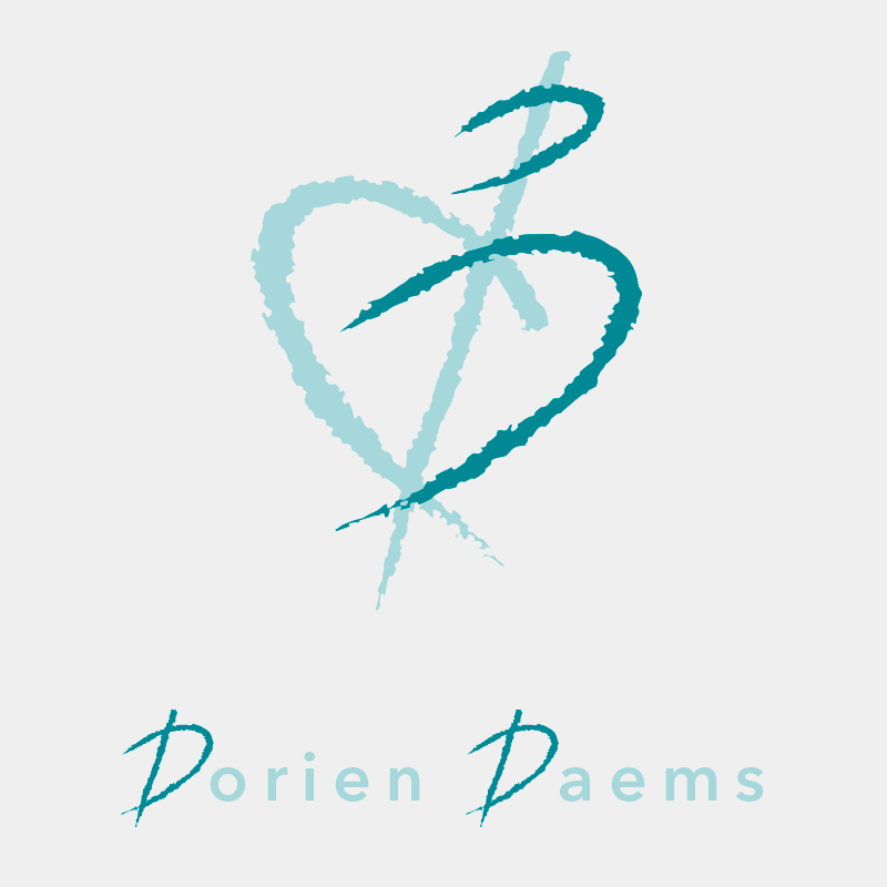
Dorien Daems is an independant midwife and was looking for a rebranding of her practition. Visuolize created this logo and style using her initials, a heart and a pregnant woman as building stones.

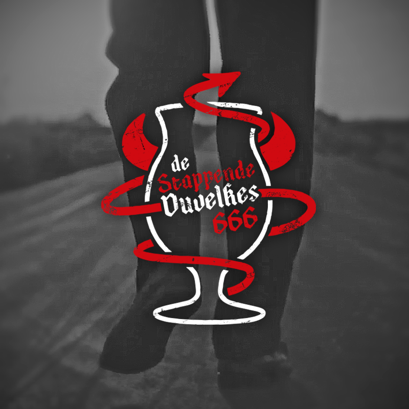
Walking and 'Duvel' beer lovers 'Stappende Duvelkes' asked me to make a new and devilish logo for their walking club. The glass represents the typical Duvel beer and the devil's tail depicts a path or trail.

Logo for the bicycle repair service shop Vélo Service.
2015 rebranding of the music and beer festival 'Weerdse Bierfeesten' introducing a new logo and marketing style.
Patrick and Ilse aka Ilske run the café P'ilske in Paal. P, Ilske, Pils and a beer bottle cap are all featured in this logo.
Beer logo for the rebranding of Pee Ikske blonde beer by Chiro Weerde.
Logo for early bookers of tickets on the tickets of Weerdse Bierfeesten.
Highdrove is a consultancy agency for a broad range of commercial activities. The logo is based on a street name and its view in the landscape which also depicts a graphic in commercial statistics.
This logo was created for the annual mountainbike event in Weerde (translated 'straight through Weerde's Hell). 
Housing and the F and R play the most important role in this logo.
Some sketching was needed to create the dynamics of this logo for a consultancy agency promoting all aspects of cycling in modern day life.
The Iron Buffalo Riders were a bunch of friends on motorcycles. They decided to start a motorfriends touring club after they had been caught up on their bikes in a hurd of bison in Yellowstone National Park. This logo was created in 1999.
Back to Top